Posts

Business Cards!

Image
Here are my finished business card designs! I really enjoyed this project and had a lot of fun designing my business cards. My favorite design would have to be the yellow card. For this project I played with a lot of different color scheme and designs and took a lot of inspiration from business cards I found online. Ultimately, I really liked working in InDesign and I'm very satisfied with how these cards turned out.

Puppet Edit

Image
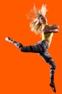
This is my toy edit. I took my inspiration from Tim Burton movies and Coraline, hence the button eyes. I used a lot of different layer masks to create the cracked, pale porcelain look. I also placed myself in the background of a puppet show. I attempted to use the puppet warp to move my hand in a more puppetish way, but I just couldn't get it to look smooth. Overall, I had a lot of fun working on this project.

Refine Edge Tool

Image
Here is my example of using the refine edge tool.

Photoshop Brush

Image
Here is my tag brush for photoshop! I decided on this color because orange is on of my favorite colors. Overall I enjoyed making the tag brush and am happy I learned how create custom photoshop brushes.

Illustrator Portrait!

Image
For my illustrator portrait, I took a lot of inspiration from the artist Shepard Fairey. I really enjoyed the bright colors of Fairey's works and I also really liked how he sort of had different shapes of color on his portrait's faces. I tried to recreate those on mine and they didn't come out as clean as I'd like them,  but I still like the sort of depth it gives my work. All in all, I think this has been my favorite project we've done in class so far

Gradient Mesh

Image
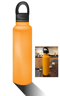
For my gradient mesh project, I decided to use my water bottle. I actually had a lot of fun with this project and it came out A LOT better than what I was expecting. I used about 6 different gradient meshes to complete this project.

Colored Logos!

Image
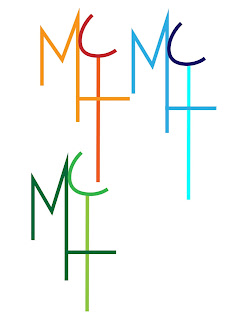
Here are the colored versions of my logos. My original colored logo is the orange and red one. I chose those colors because the color orange is often associated with being confident and warm, while the color red is associated with being bold. I wanted my logo to convey a sense of confidance and openness so I decided to go with warm colors.